This workbook provides analysis of activity surrounding referrals and discharges.
Useful Information
This workbook looks at activity based at referral level.
All dashboards will contain various reports. Each report will have a selection of filters and dimensions which when chosen for one report, will apply to the other dashboards.
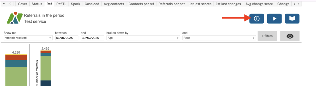
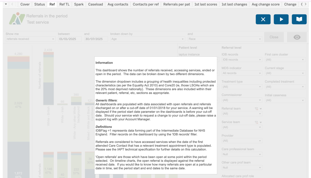
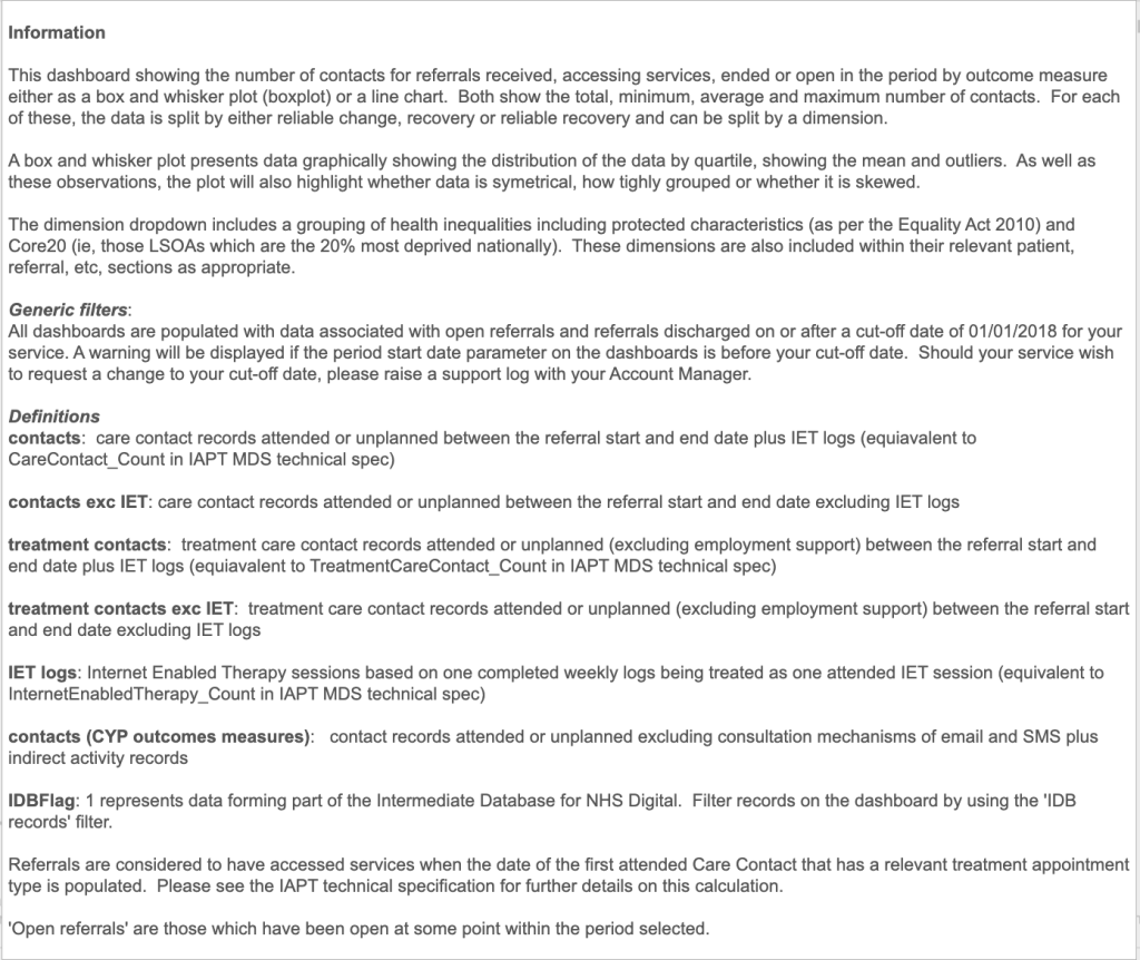
Details of the calculations used for each report, as well as additional information, can also be found in the i tool tops in the top right of each report, as shown.
Each report will provide a graphical interpretation of the data and by hovering over sections of the report, more detailed information is provided (see below).
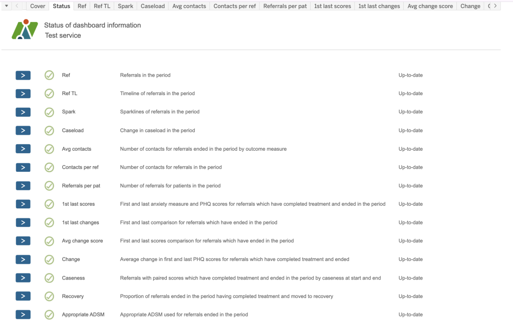
List of available Dashboards
Current list and descriptions of available dashboards.
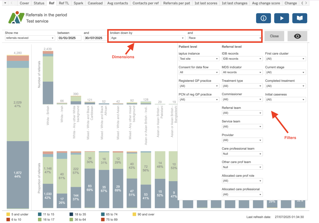
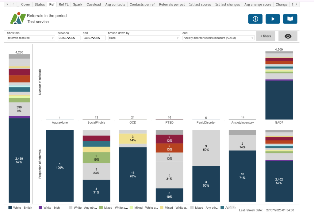
Ref
Referrals in the period.
Please note: Dimensions have been applied in this example.
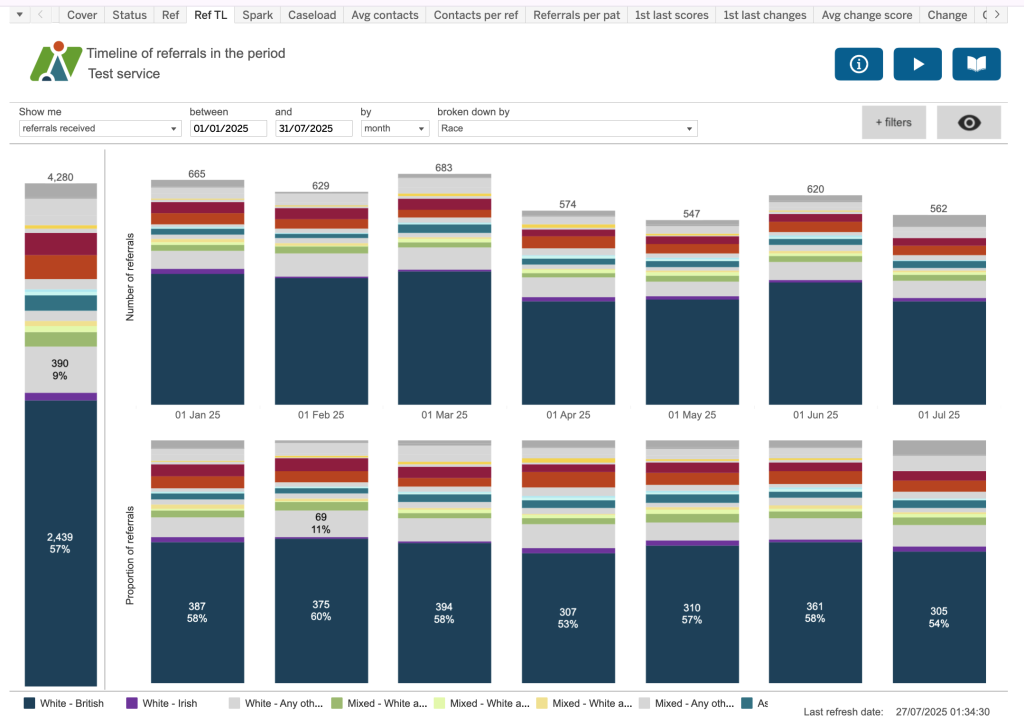
Ref TL
Timeline of referrals in the period.
Please note: Dimensions have been applied in this example.
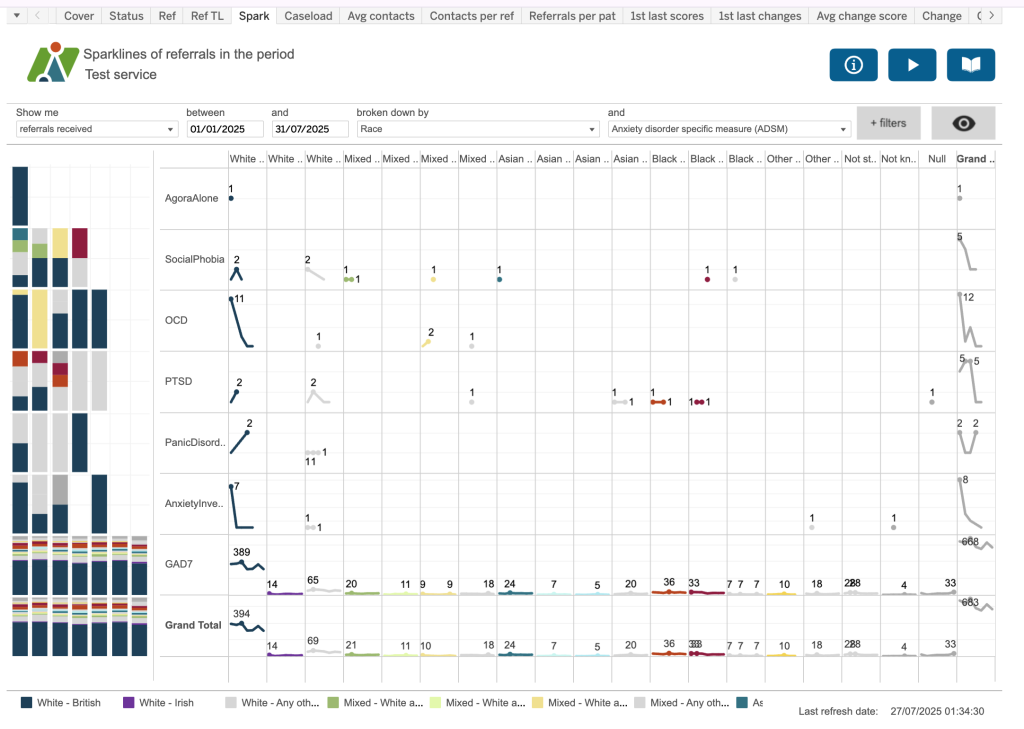
Spark
Sparklines of referrals in the period.
Please note: Dimensions have been applied in this example.
Dimension 1 is displayed as columns and dimension 2 by rows. Over on the left, will show you the same information displayed as a bar chart.
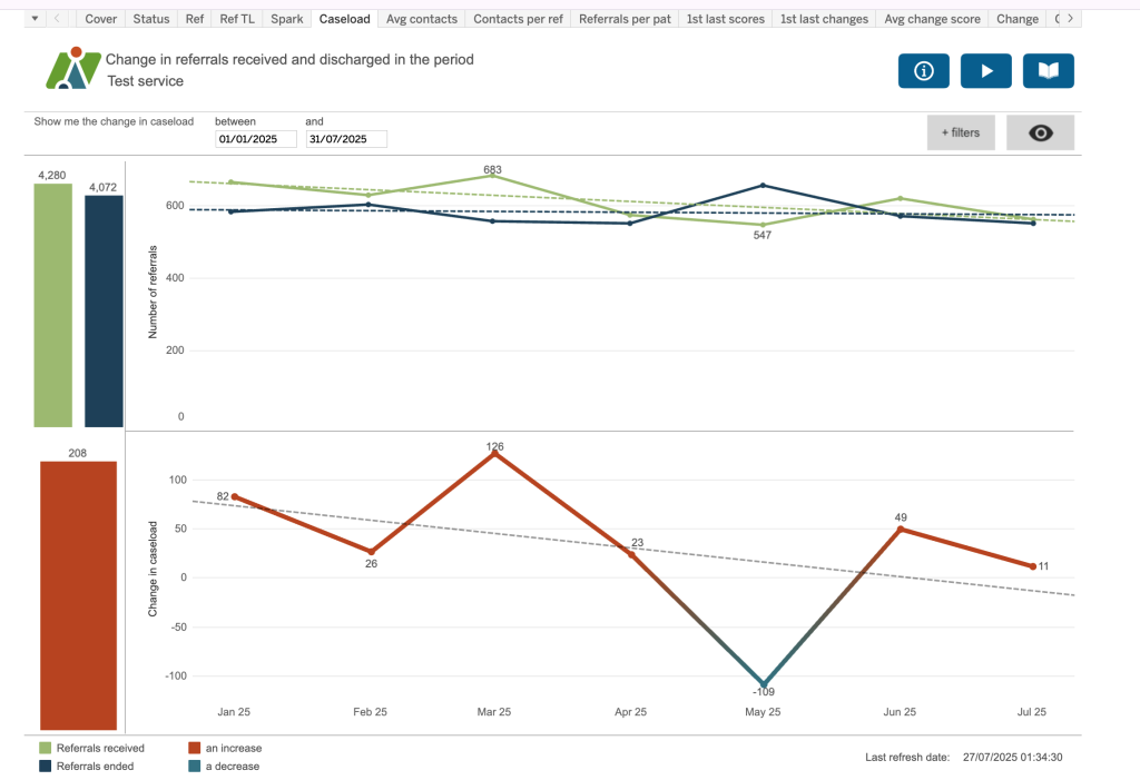
Caseload
Change in referrals received and discharged in the period.
The top chart show number of referral received in the period (green line) vs number of referrals discharged in the period (blue line) along with a trend line.
The bottom chart demonstrates an increase (red) or decrease (light blue)in the case load based on the top chart.
Avg Contacts
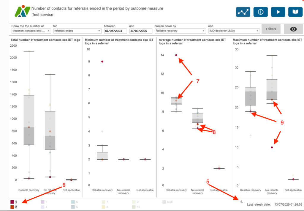
This dashboard allows you to visualise the spread of results between different categories using a box and whisker dashboard.
A box and whisker plot, also known as a boxplot, is a standardized way of displaying the distribution of data based on a five-number summary: minimum, first quartile, median, third quartile, and maximum. It visually represents the data’s center, spread, and skewness, and helps identify potential outliers.
Here’s a breakdown of what the plot shows:
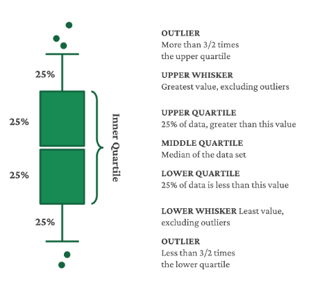
Box: The box itself represents the interquartile range (IQR), which is the range between the first quartile (25th percentile) and the third quartile (75th percentile).
Line inside the box: This line indicates the median (50th percentile) of the data.
Whiskers: The whiskers extend from the box to the minimum and maximum values within a certain range (usually 1.5 times the IQR), beyond which outliers are plotted as individual points.
Outliers: Data points that fall outside the whiskers are considered outliers.
In this example, we can see the number of treatment contacts (excluding IET logs) for each referral – the total, minimum, average and maximum.
(1) Each coloured dot represents the IMD decile for the LSOA of the patient’s residence. An LSOA is a geographical area used by the Office of National Statistics (ONS) for census reporting. Each area has about 1000 to 3000 people resident. IMD is the Index of Multiple Deprivation. It is a method of gauging the level of deprivation from one area to another. A score is given to each LSOA and these can then be ranked. A decile ranks areas from the most to least deprived in ten equal groups. So LSOAs in Decile 1 are the most deprived 10% of LSOAs in England.
(2) These are coloured in red
(3) and the least deprived in green.
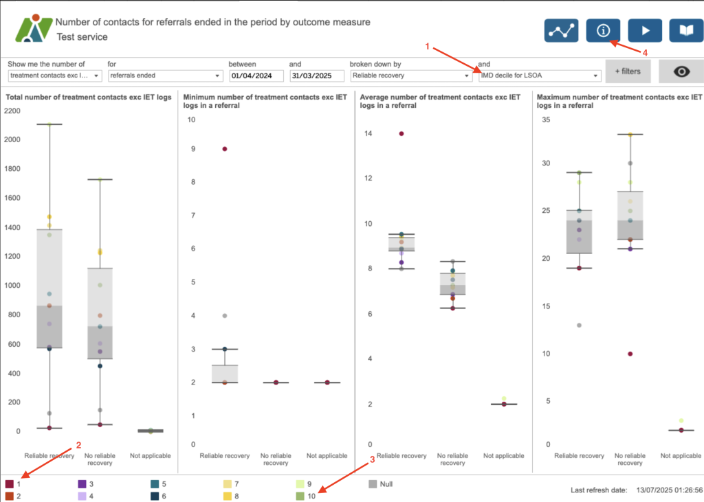
(4) The information button helps to understand the different elements of the plot but generally we can see that those referrals with the lowest treatment contacts are from the more deprived areas.
If you hover over the legend a highlight button will appear (5). This allows you to highlight any selection – (6) here we have selected the IDM decile 1 and 2. [(7) This shows you that the referrals where the patients live in the most deprived areas tend to have higher average numbers of treatment contacts in order to reliably recover compared to other deciles, and (8) when they don’t reliably recover they have a lower average number of treatment contacts. (9) The maximum number of treatment contacts for the more deprived deciles is below all of the other deciles.
Contacts per ref
Number of contacts for referrals in the period.
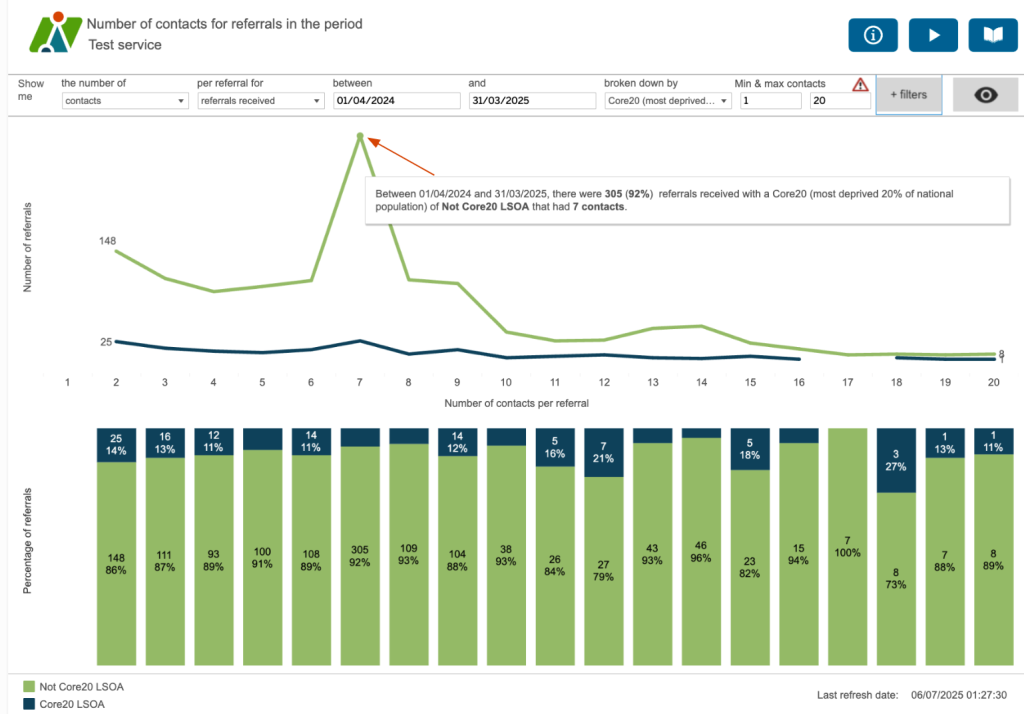
This dashboard helps to identify where there might be differences between various characteristics in the number of contacts per referral. Here we’re looking at the split between those referrals where the patients’ residence is from an LSOA which is considered one of the Core20 or not a Core20 LSOA. The Core20 LSOAs are the most deprived 20% of LSOAs nationally. For this service, the majority of referrals which are not the most deprived nationally have 7 contacts. Although there is a small spike in those that are deprived, there isn’t the same significant spike – indeed it looks as though a similar (if not slightly lower) number of referrals have 7 contacts compared to those that have two.
Avg change score
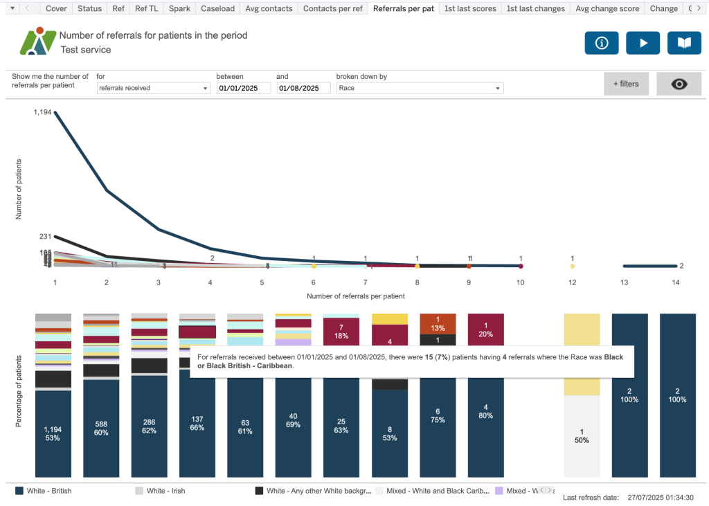
Number of referrals for patients in the period.
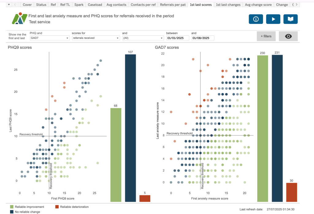
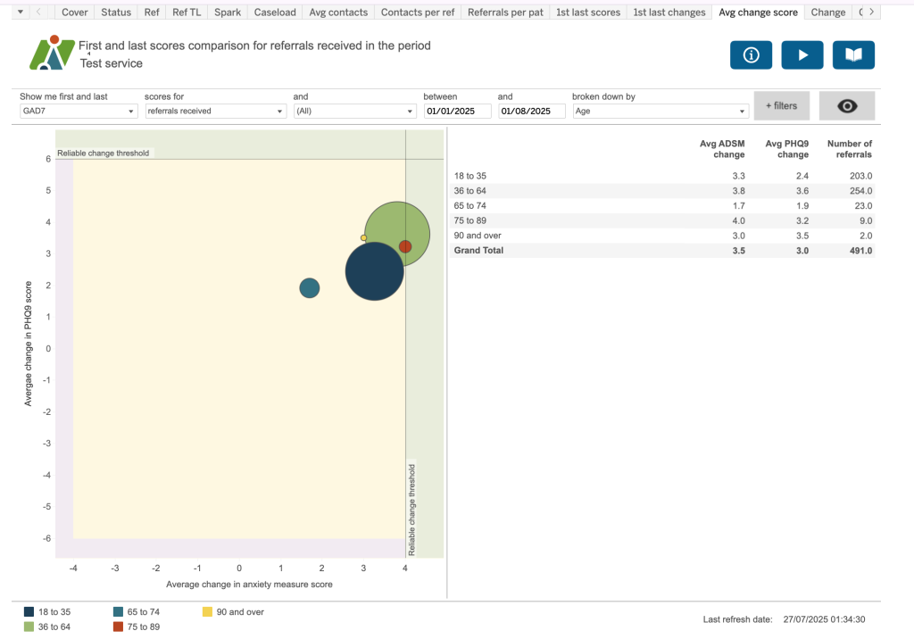
1st last scores
First and last anxiety measure and PHQ scores for referrals received in the period
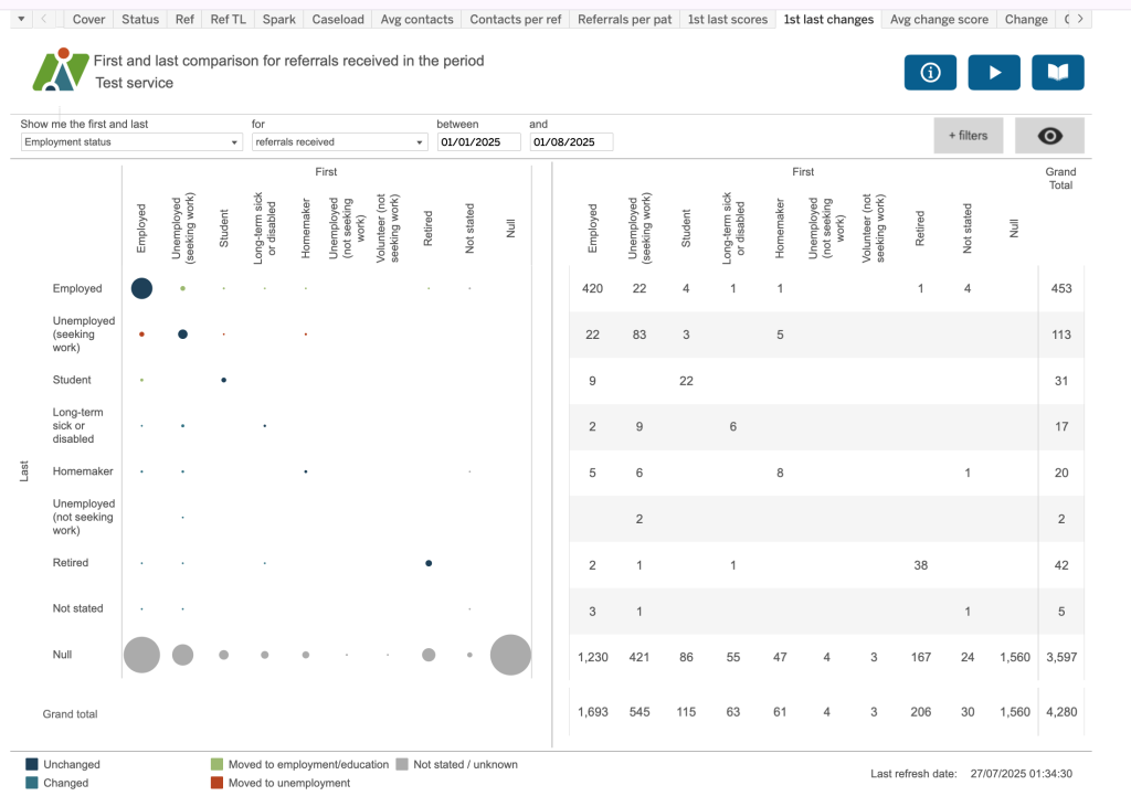
1st last changes
This dashboard shows the first and last status for employment, sick pay, sick absence, care cluster and psychotropic medication. The chart on the left shows first and last indicated by a coloured dot (see key) and the right chart gives you the data behind each value.
Avg change score
The dimensions dropdown includes a grouping of health inequalities including protected charactieristics (as per the Equality Act 2010) and Core20 (ie, those LSOAs which are the 20% most deprived nationally). Theser dimensions are also included within their relevant patient, referral, etc, section as appropriate.
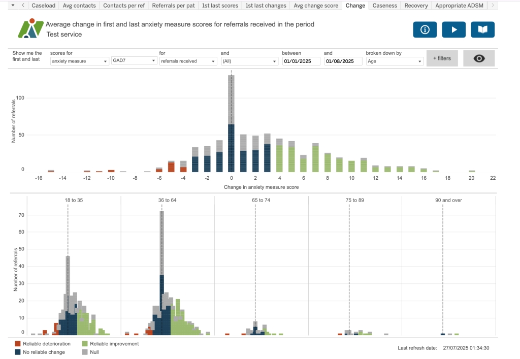
Change
Average change in first and last anxiety measure scores for referrals received in the period.
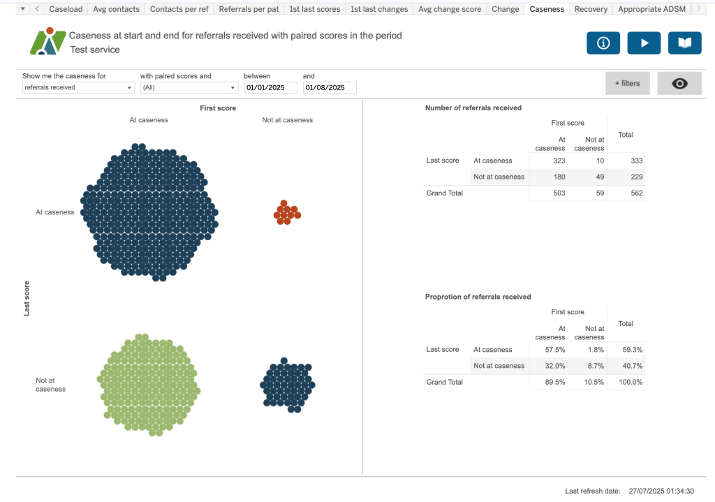
Caseness
Caseness at start and end for referrals received with paired scores in the period.
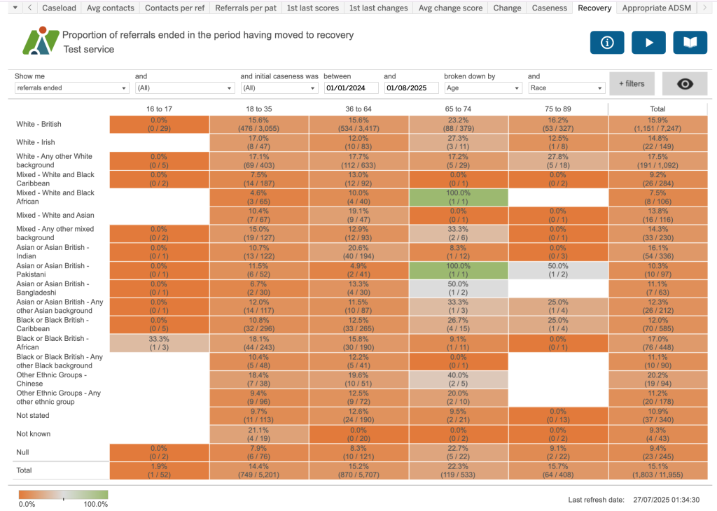
Recovery
Proportion of referrals ended in the period having moved to recovery.
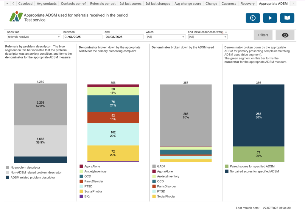
Appropriate ADSM
Appropriate ADSM used for referrals received in the period. This dashboard shows the number of appropriate ADSMs used for referrals received, accessing services, ended or open in the period.