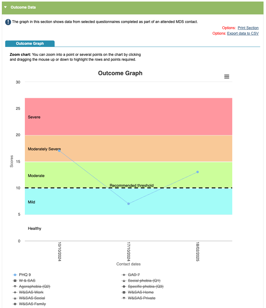
Outcome Graph
The graph in this section shows data from selected questionnaires completed for attended, MDS sessions.
When selecting a specific questionnaire to track scores on the graph, you will be able to see the threshold for the questionnaire.
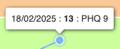
When you hover over a point on the graph it will show you the session date, time and score.
You can switch on different questionnaires by clicking on or off of the headings. You can view multiple scores on the graph or you can toggle all questionnaire scores on and off. You also have the option to ‘Toggle Interpolation’, which means it will make guesses about the graph in between the data points.
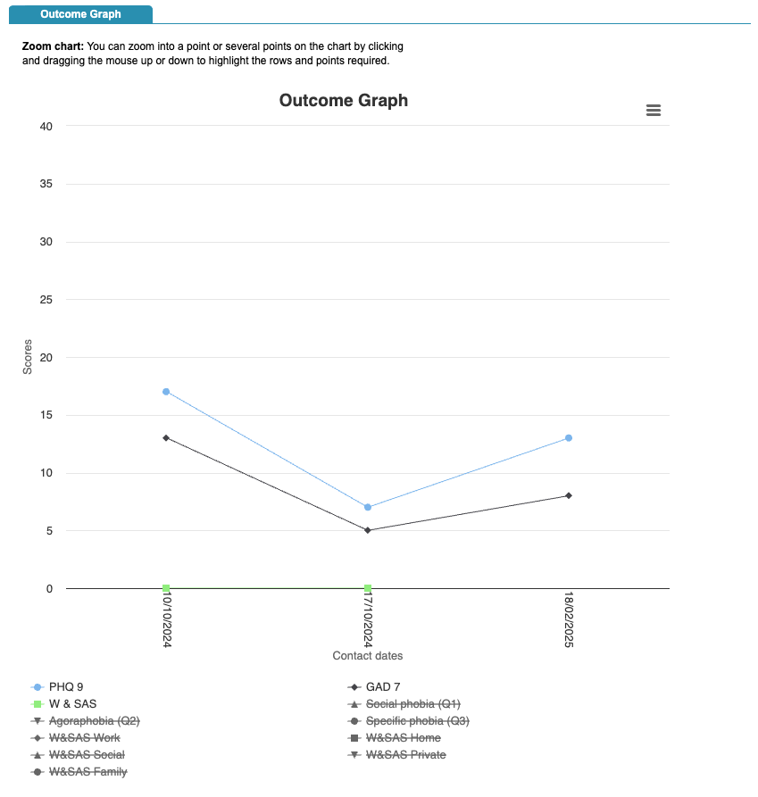
Viewing more than one questionnaire scores will remove the threshold line, as the outcome measures have different threshold bands.
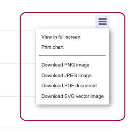
In the right hand corner of the graph, you have the options that will allow you to print or download the data in the graph in different formats.
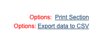
You can also print the full section or export this using the ‘Print Section’ and ‘Export data to CSV’ options.
If you have a lot of sessions recorded there is an option to zoom in on a particular point of interest, by clicking
and dragging the mouse up or down to highlight the rows and points required. Once you have used the zoom, there will be an option to reset it.
Outcome Table
Below you will be able to see the Outcome Table, which shows the same information on the graph as a table.
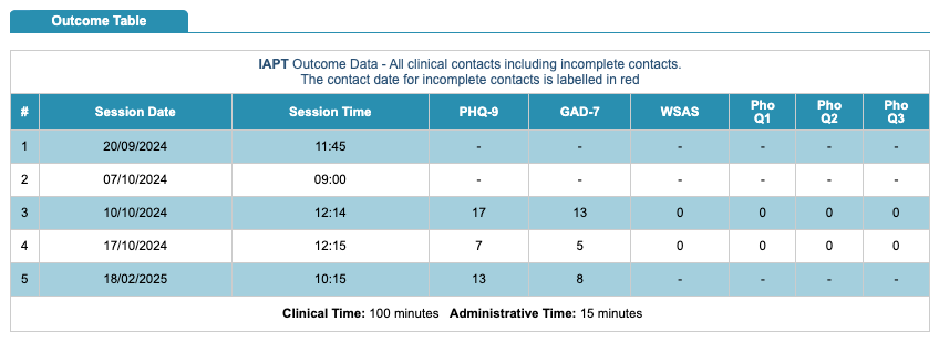
You will see a total of the clinical time and also the administrative time.