The monthly IAPT reports from NHS England (http://content.digital.nhs.uk/iaptmonthly) present a number of key measures. The file includes the construction and derivations used for each measure. The link given also shows some useful related documents such as IAPT Reporting FAQs. These dashboards are displays of the information included in the monthly reports and enable you to select your service provider to compare with other providers included in the submissions.
Measure TL
This first dashboard is looking at a timeline of activity for the selected measure.
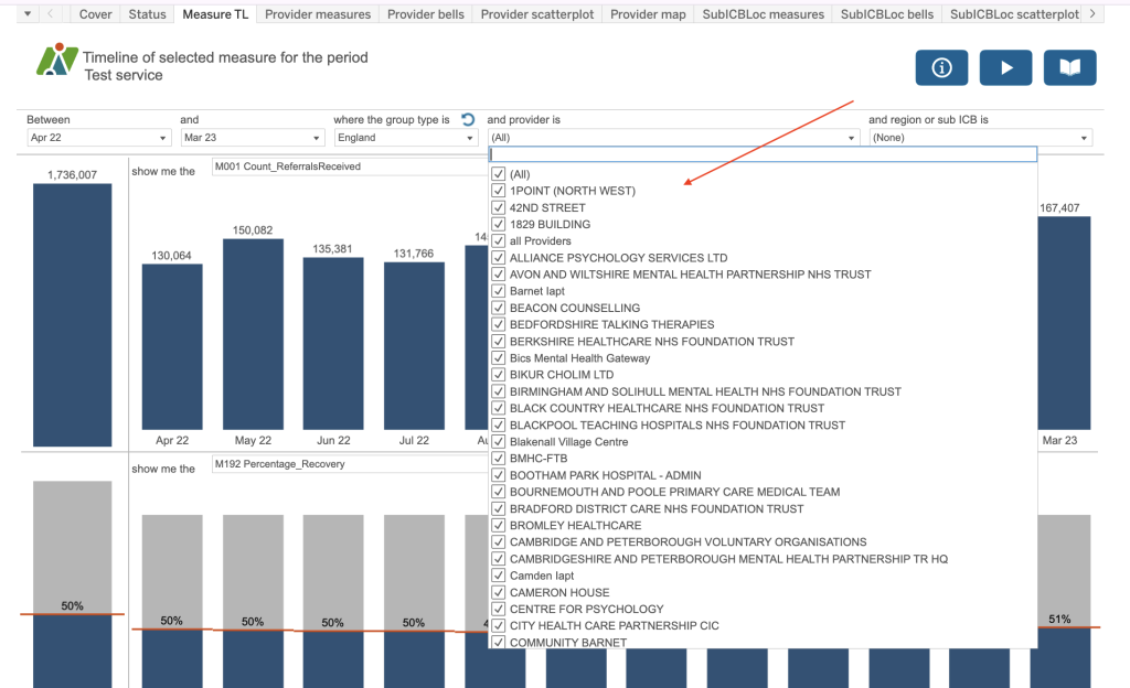
Use the boxes at the top of the dashboard to create a sentence that most accurately describes the analysis you require. For example, “Between April 2022 and March 23 where the Group type is England and provider is All and sub ICB is all SubICBs show me the M001 Count of referrals received” and “show me the M192 Percentage recovery”. So you can see two different measures on the dashboard at any one time.
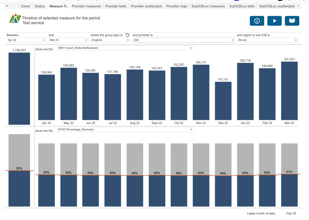
If you choose the group type of England, there is no breakdown available by provider and SubICB. If you choose the group type of Provider there is no breakdown by SubICB and if you choose the group type of SubICB there is no breakdown by Provider. SubICB/Provider has a combination of both.
In the top right are some blue buttons:
- Information Button
- Demo Button
- Help Guide Button

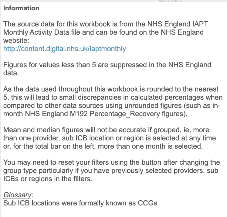
The information button will identify any filters which have been applied behind the scenes that you don’t have access to or any special calculations.
You will be able to access a video from the demo button and the help guides provide some prompts to remember some of the key points on the dashboard.
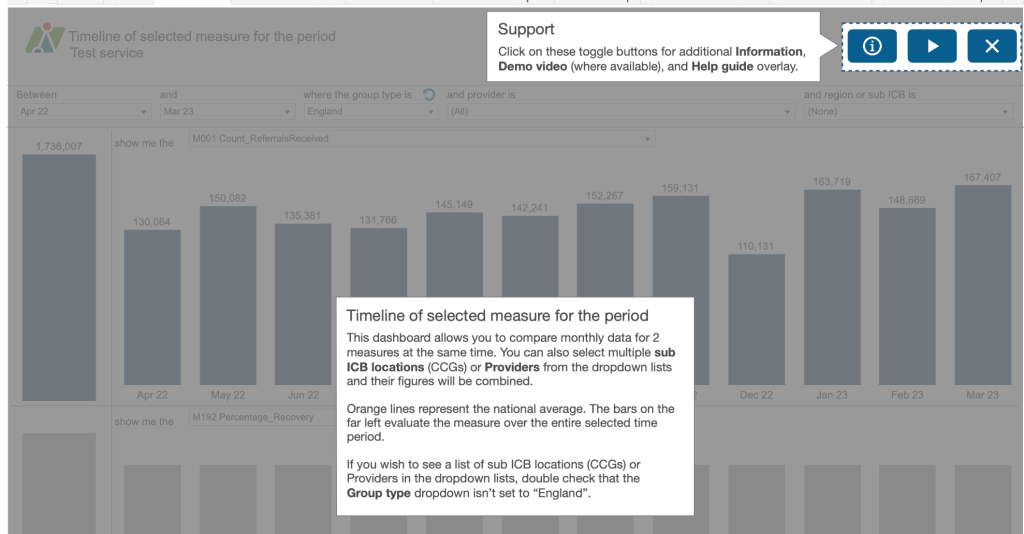
If you would like to download the charts or the figures behind the charts, use the download button on the bottom right of your screen.
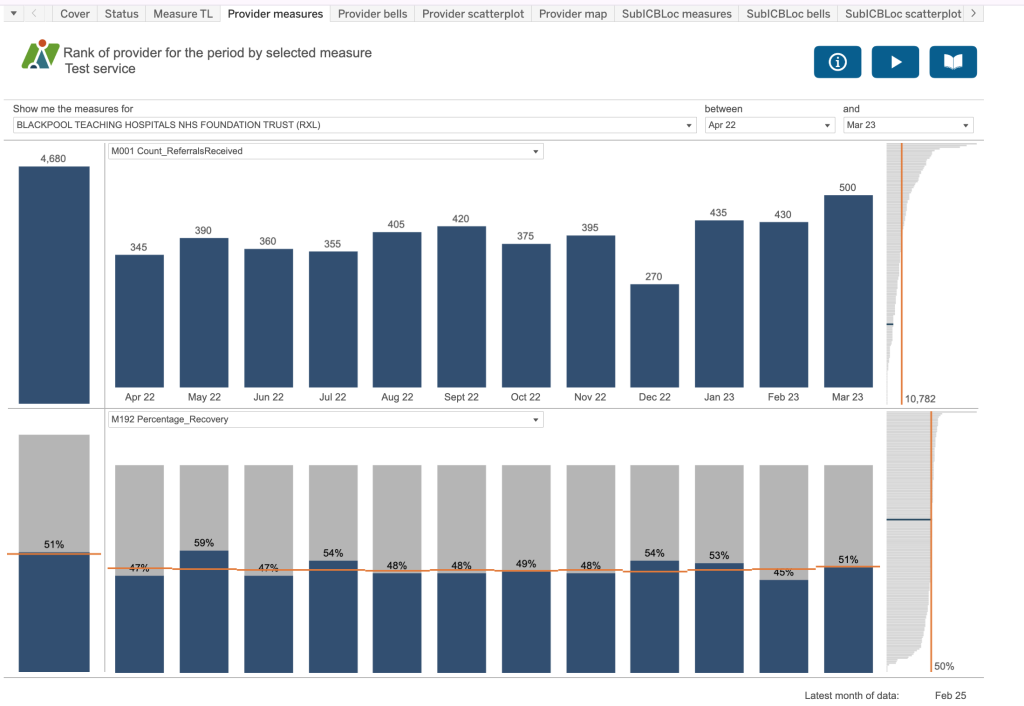
Provider measures
In this dashboard you can select a particular provider from the dropdown list, see their activity for the two selected measures and also a rank chart to the right. The England average is highlighted in orange with the value for the selected measure and an idea of where your selected provider is compared to all the other providers in the dataset – highlighted in blue.
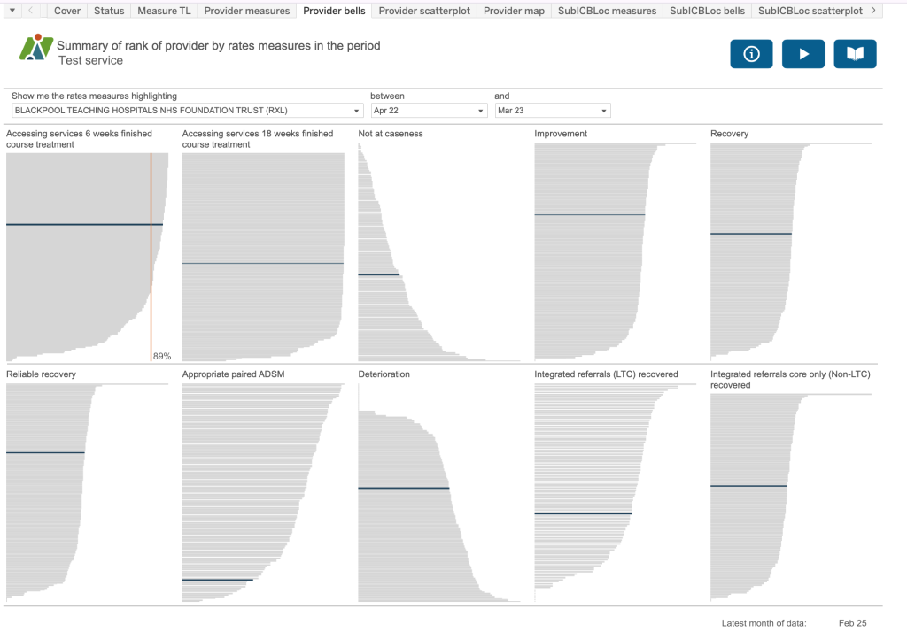
Provider bells
This dashboard takes 10 key rates measures for example, the proportion of referrals which finished a course of treatment that accessed services (or had their first treatment appointment) within six weeks of referral, or the proportion of referrals ended which were not at initial caseness. If you look in the information button, it will identify the measures included on this dashboard so that you can refer back to the metadata documentation for precise definitions and construction.
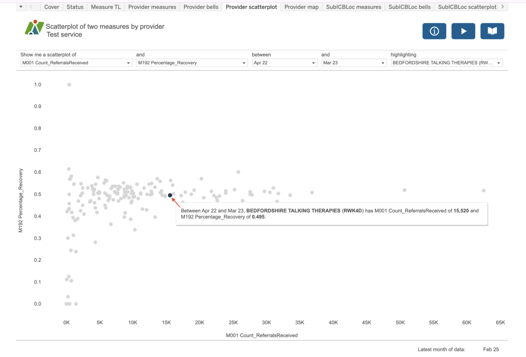
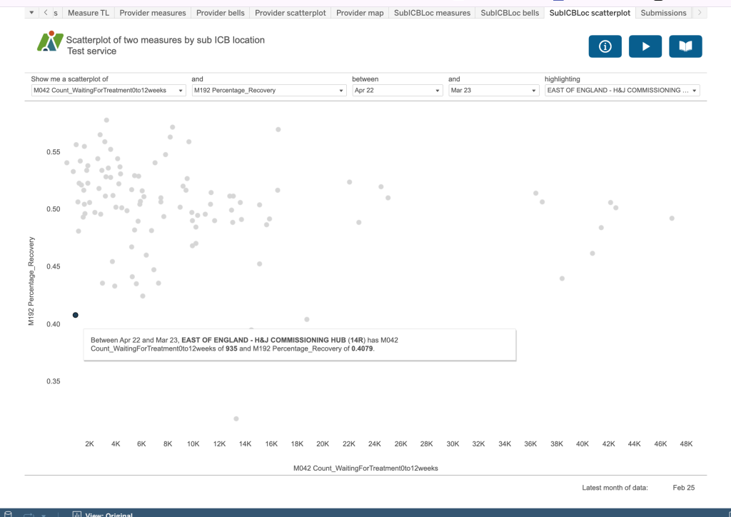
Provider scatterplot
This dashboard takes two selected measures and plots the values on two axis. The provider selected will be highlighted in blue on the chart.
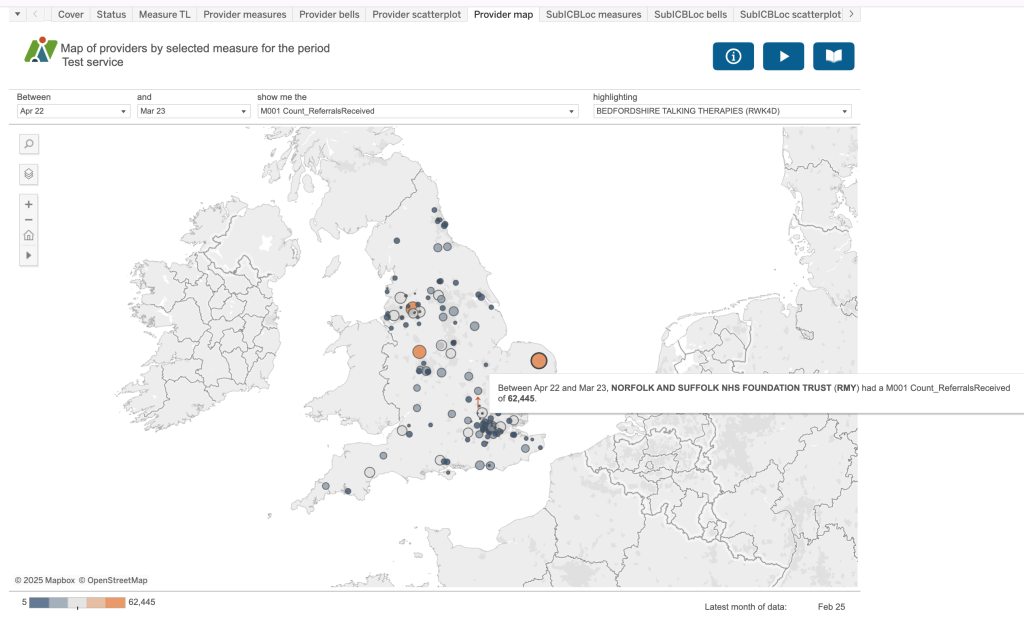
Provider map
This dashboard plots the location of the providers in the dataset. The size and colour of the dot represents the value for the measure selected. If you have chosen a provider to highlight, you will see this provider picked out with a small red arrow on the map.
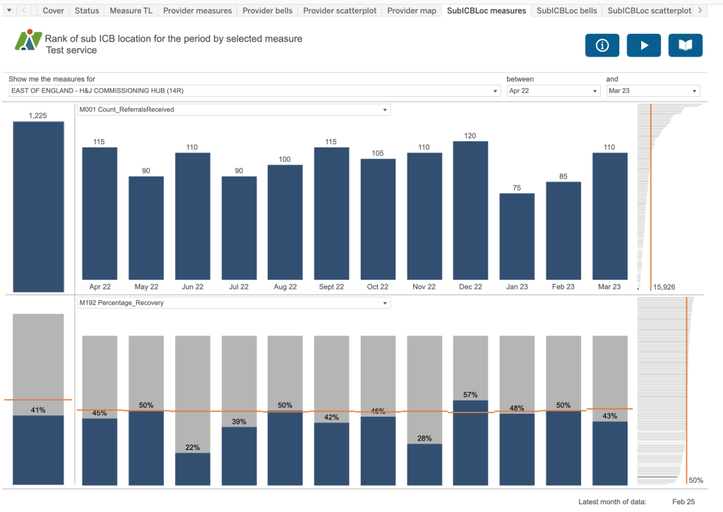
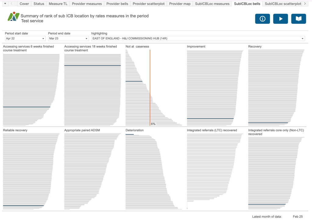
The next three dashboards are the same as for the provider ones but with a SubICB focus.
SubICBLoc measures
Rank of sub ICB location for the period by selected measure
SubICBLoc Bells
Summary of rank of sub ICB location by rates measures in the period
SubICBLoc scatterplot
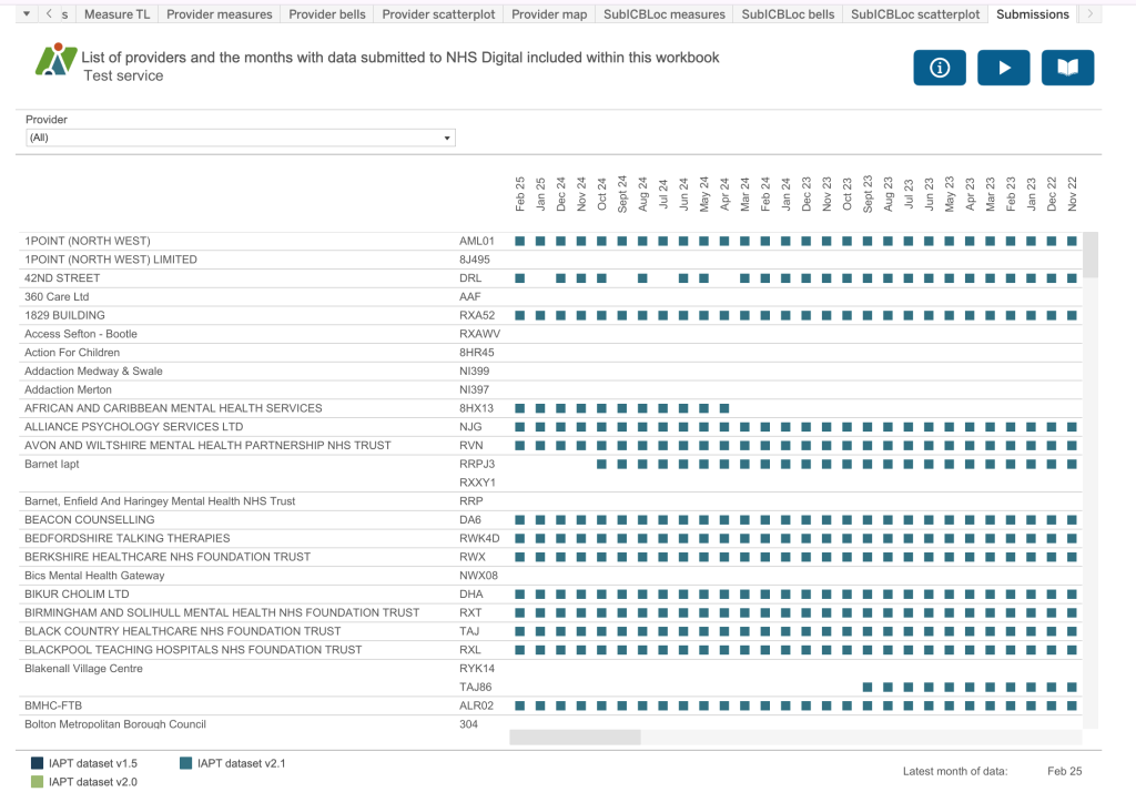
Submissions
This final dashboard identifies all the providers who have submitted data to NHS England since January 2015 with a coloured square next to each month that data has been submitted. If the same provider has had two or more provider codes associated with them, for example Barnet IAPT, you will see multiple lines for that provider. The colour of the square represents the dataset version in use at the time of submission.