Dashboards are a graphical representation of your data and contain complex calculations. Dashboard data is compiled overnight. Therefore when you look at a dashboard, you a viewing data as of yesterday. Any information changed within you database will therefore, be reflected, the following day.
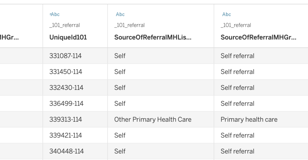
The MDM Dashboard use the data directly from the dataset (similar to the monthly NHS England exports). This means you will only be able to report on the MDS values, not your front end list values. For example, if you have
two attended options available in iaptus, one called ‘Attended’ and one called ‘Attended with Interpreter’ but
both options are mapped to the MDS value ‘Attended on time or, if late, before the relevant care professional
was ready to see the patient’, they will both appear as ‘Attended on time or, if late, before the relevant care
professional was ready to see the patient’ in any of the Dashboard reports. Other Dashboards use front end values
Giving access to Dashboard
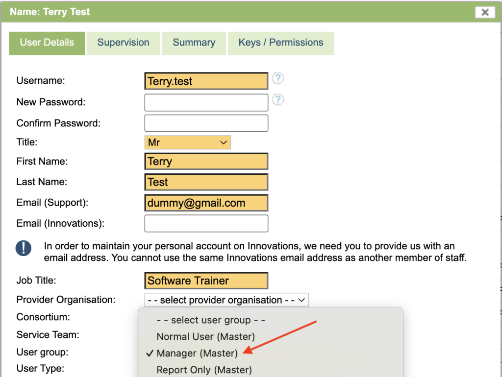
Access to the Dashboards feature can be switched on for individual users. Dashboards access sits under the Manager group, however if you wish another group to be setup for this permission, please let your Account Manager know through a support log.
To switch the feature on for a user you will need to:
Go to the User menu in the Superuser section
Click on the user’s name to see their details
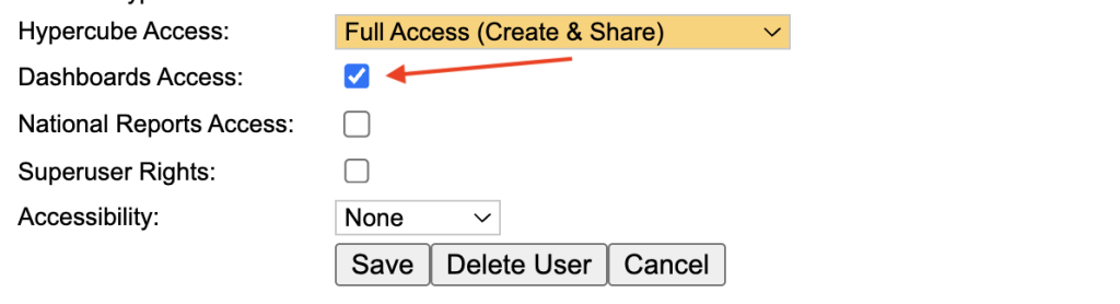
Tick the Dashboards Access box
Click on Save
Users may need to logout of iaptus and then back in for the change to take effect.
Under the Superuser menu, select users and double click on the user to open the user window or Register New user to add a user from scratch. Under User group, select Manager (or the Group that has the Dashboard permissions).
In addition to the permission group, you need to tick the Dashboards Access option, this gives access to the Dashboard tab.
Accessing Dashboards
Select the Reports Icon.
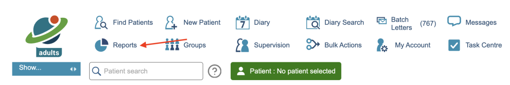
You will be presented with the reports window, select the Dashboards Tab
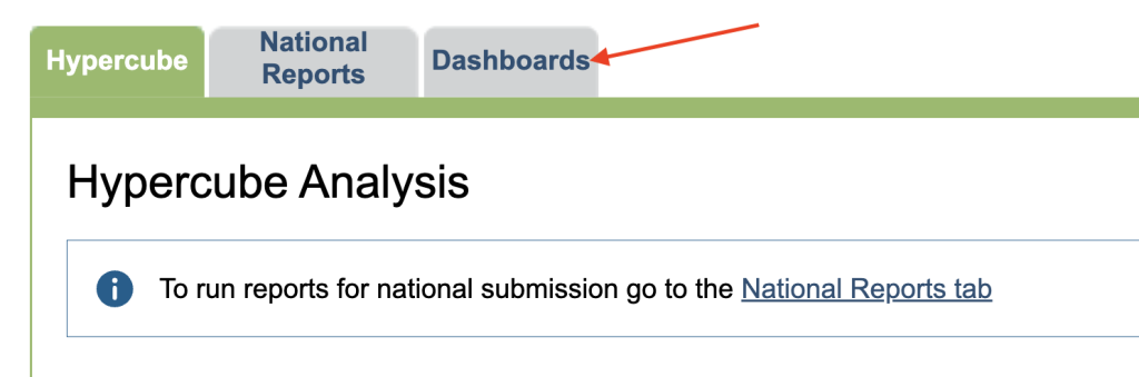
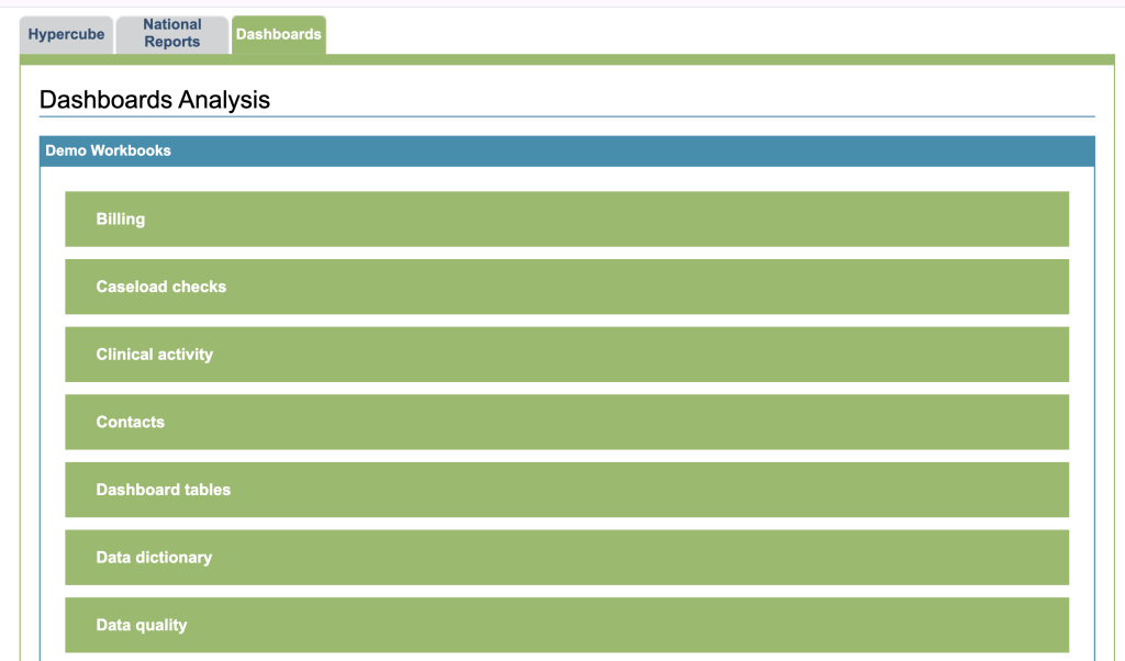
You will be presented with a list of workbooks. Workbooks contain Dashboards based on the Workbooks description. To open a workbook, click on the heading. The Workbook will open on a separate tab, Please be aware if you leave iaptus running in the background but do not use it, it will still log you out after 20 minutes.
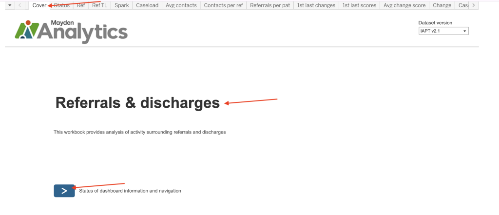
The Cover Page
When you open a Workbook, you will be presented with the Cover page. The Cover page will give you the name of the workbook and a button that will take you to the Status page.
Navigating the Workbook
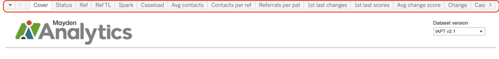
The Menu
Some workbooks that contain a large amount of dashboards, will allow you to select a dashboard by clicking a menu, found top left.
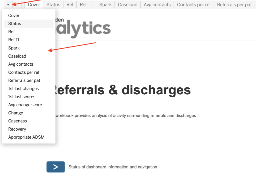
The Tabs
You can also select a dashboard by clicking the a appropriate tab along the top
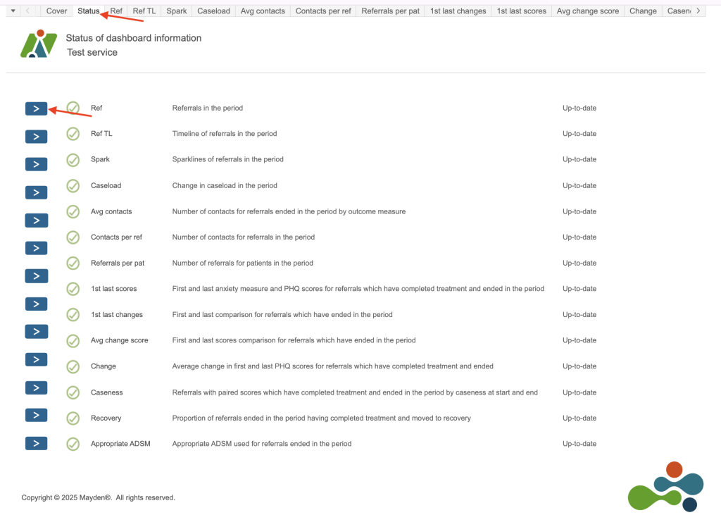
The Status Page
You can also view the Status page. This gives you a list of available dashboards along with a description of what each one will display. You can also access a dashboard by clicking on the arrow to the left of it.
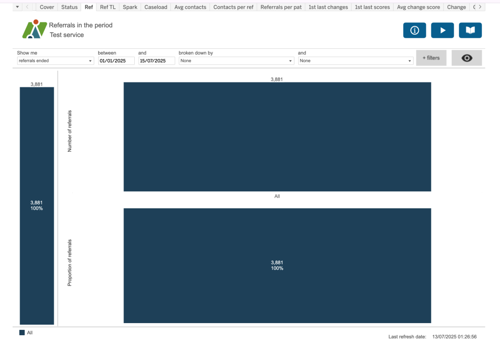
Dashboard Breakdown
We are using the Referrals in period in this example, other dashboards will look different, but the concepts are the same.
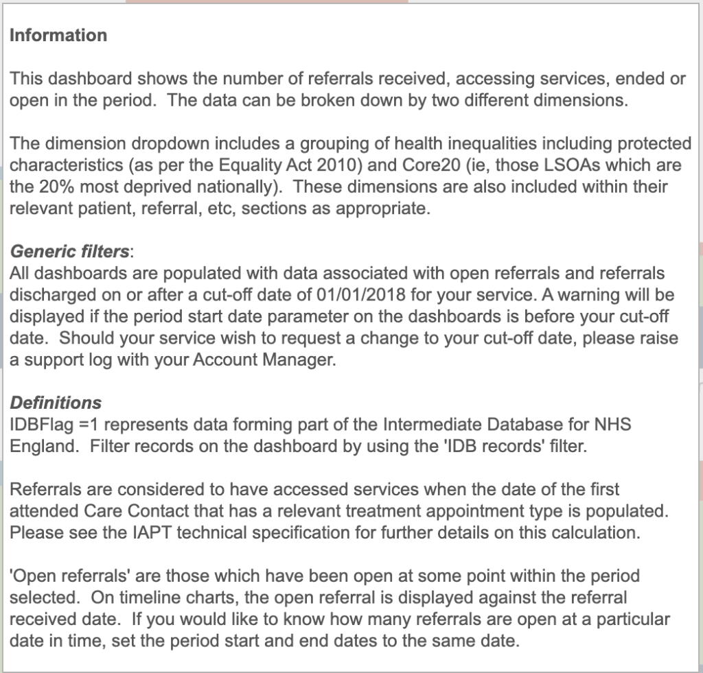
Information Overlay
The Information Overlay button can be found top right of the screen
Its aim is to give you information about the current dashboard.
Demo Video Overlay

The Demo Video Overlay button can be found top right of the screen
If one has been created, this will play a demo video for the workbook.
Help Guide Overlay

The Help Guide Overlay button can be found top right of the screen.
This displays a help guide for the dashboard, showing pop up boxes for the different components of the screen.
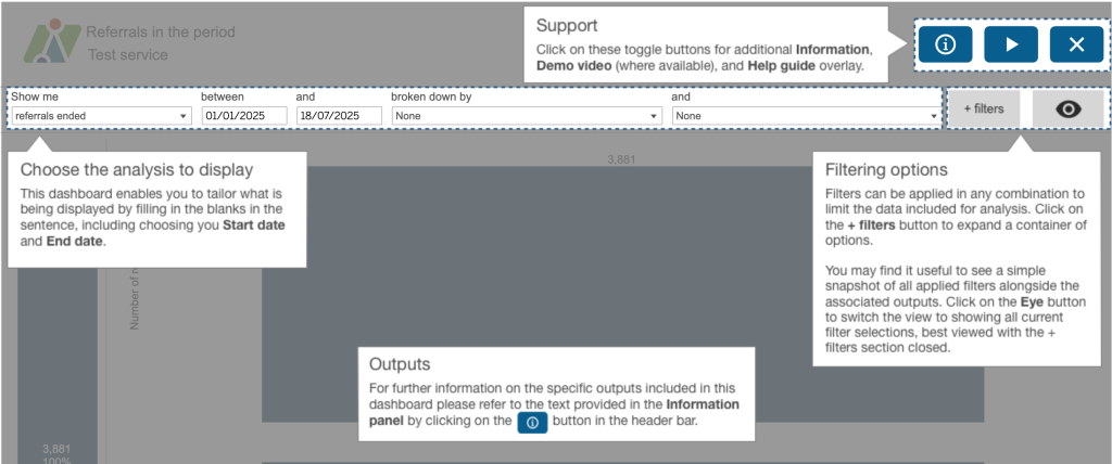
Dashboard Filters
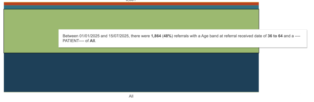
At the top of each reports you will see several filter options, these will differ for each dashboard. In this example it reads as a sentence.
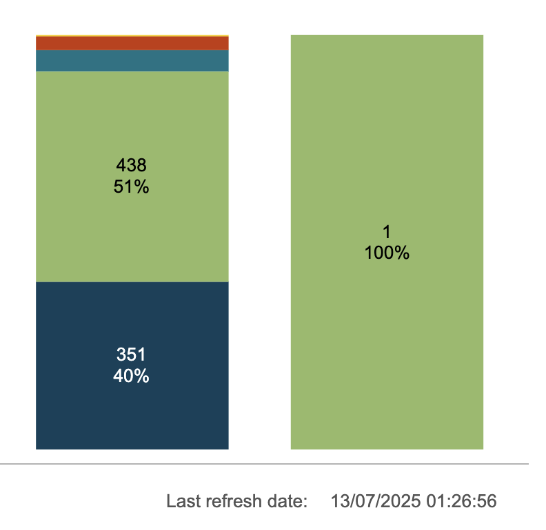
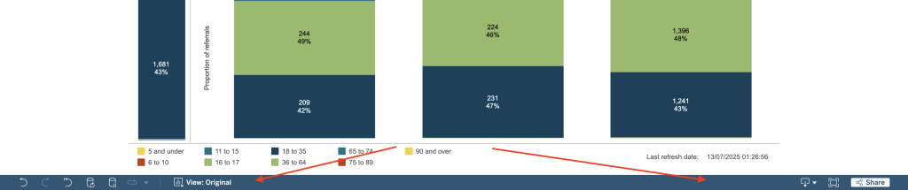
In this example we are looking at Referrals ended between 1/1/2025 and 15/7/2025. The chart is broken down by 2 dimensions. Age band at referral received date and Discharge reason. The first dimension, Age band at referral received date, is shown on the chart as colours, the key is displayed at the bottom, and the second dimension, Discharge reason, is displayed as individual bars with a label at the underneath each bar.
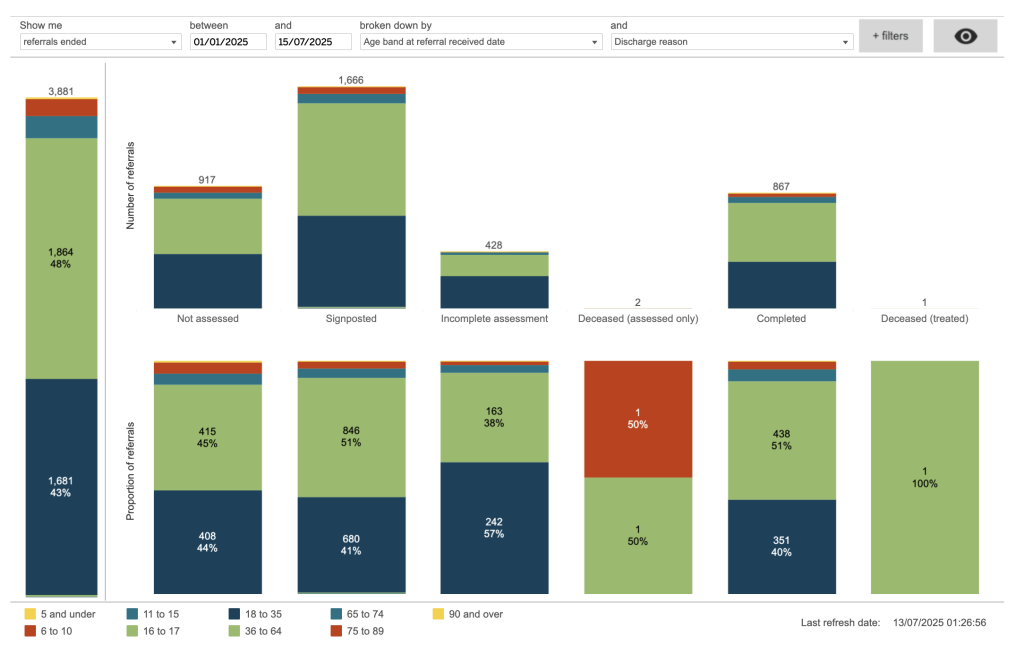
There are 3 charts being displayed in this example. The top row is showing the number of referrals, the bottom row is showing a proportion of referrals, shown as a percentage. On the left is the total bar broken down by the first dimension colours.
When you hover over a particular section, it will display a popup displaying a breakdown of what that section represents.
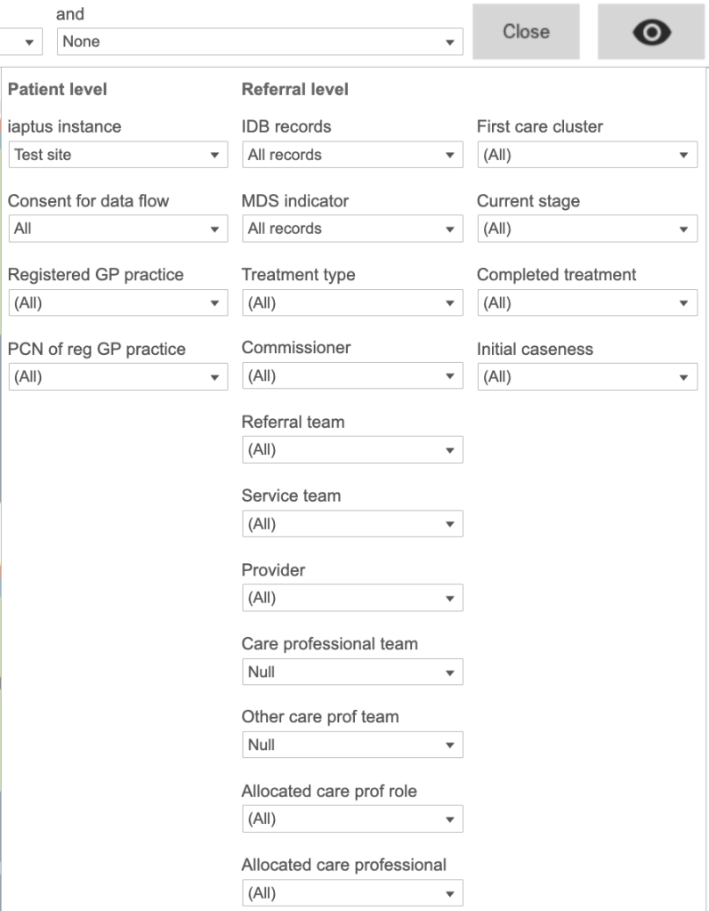
Additional Filters
You can apply additional filters to the Dashboard, Click on the Filters option, top right.
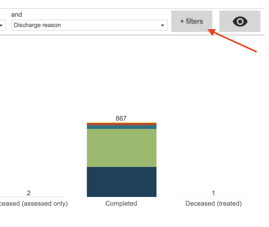
The Filters available will depend on the Dashboard, when you open the filters, it will display a window with a list of the different filters you can apply.
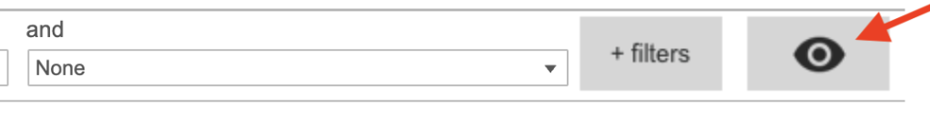
Viewing applied filters
The Eye button will allow you to quickly check what filters have been applied to the graph,

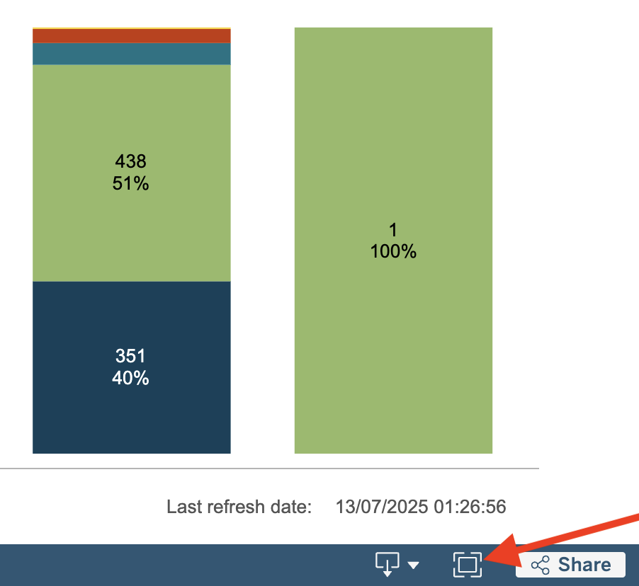
Last refresh date
To check how up to date the information displayed in the Dashboards is, the time when the
data was extracted from your live site is displayed at the bottom of the full page workbook.
This is always a day different to today’s date. So any data added today will on the system
tomorrow.
The bottom blue bar
There are some useful buttons in the bottom blue bar.
Undo/Redo Refresh, Pause and Replay Animation
These buttons can be found bottom left.
Undo/Redo – Will undo or Redo you last action.
Refresh – Will refresh the data and graph
Pause – This is a really useful button. You will notice that when you apply filters, the dashboard will redraw the chart each time, which can take a little while to refresh. Using the Pause button will stop this from happening and allow you to select multiple filters at a time saving refresh time.
Replay Animation – You can replay data visualisations with animations to see data trends and changes faster. Pairing a data visualisation with animation provides repeated exposure to your data, which helps you interpret data, make comparisons among values, focus attention, and spot patterns in your data quickly.
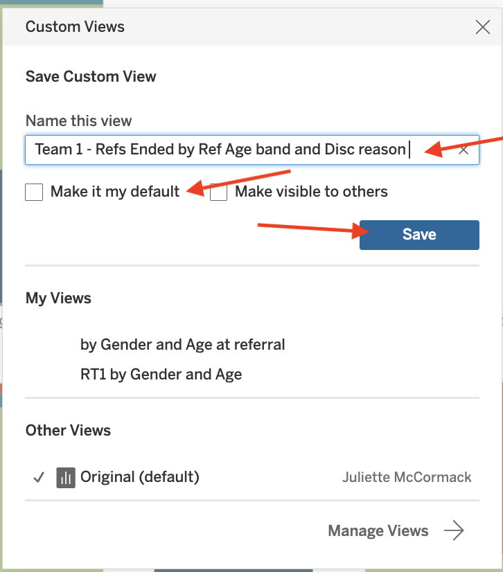
Saving a View
Applied filters can be saved as a view, saving you time reapplying them every time, you can also set a default view so that every time you go into that dashboard that view is automatically applied. Please be aware that if you change the default, you will be changing it for all users of your service.
When you click on view, you will be presented with the Custom Views Window. You can save the current view by giving it a name, you can also make it the default and then select save. Make it visible to others isn’t a valid option as your service uses one account and so all users of your service can see it.
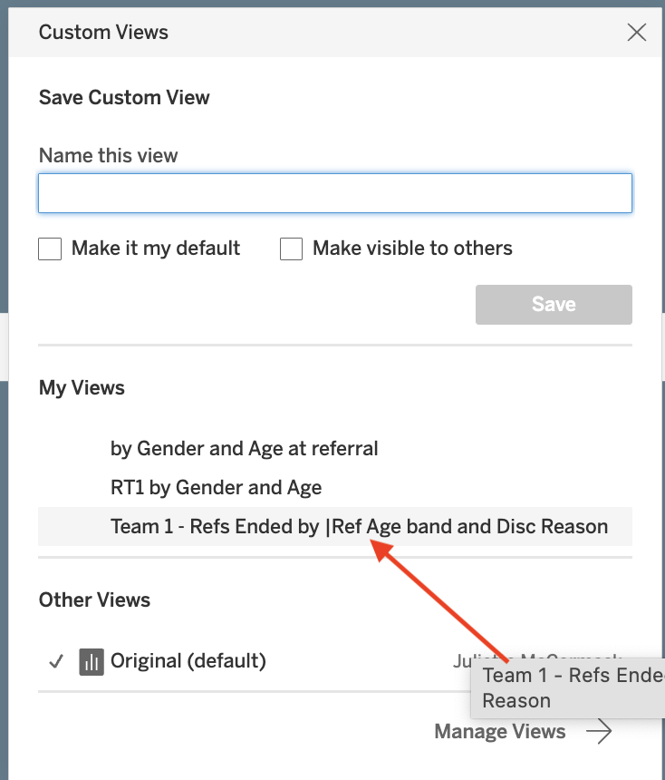
Applying a View
To apply a view, click on View and select the view under My Views, your view will be applied.
Downloading a Dashboard and underlying Data
Bottom right of the dashboard page, there is a icon for downloading
You will be presented with 5 options, Image, Data, Crosstab, PDF and PowerPoint.
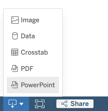
Image
This option will Download an image of the view in .png format. Any filters, parameters, or selections currently applied in the dashboard are reflected in the downloaded image.
Data
This is a very useful option. it allows you to view and download the underlying data behind a dashboard, which you can then use to interrogate the data further.
Before you download the data, you first need to tell the system what data you wish to download.
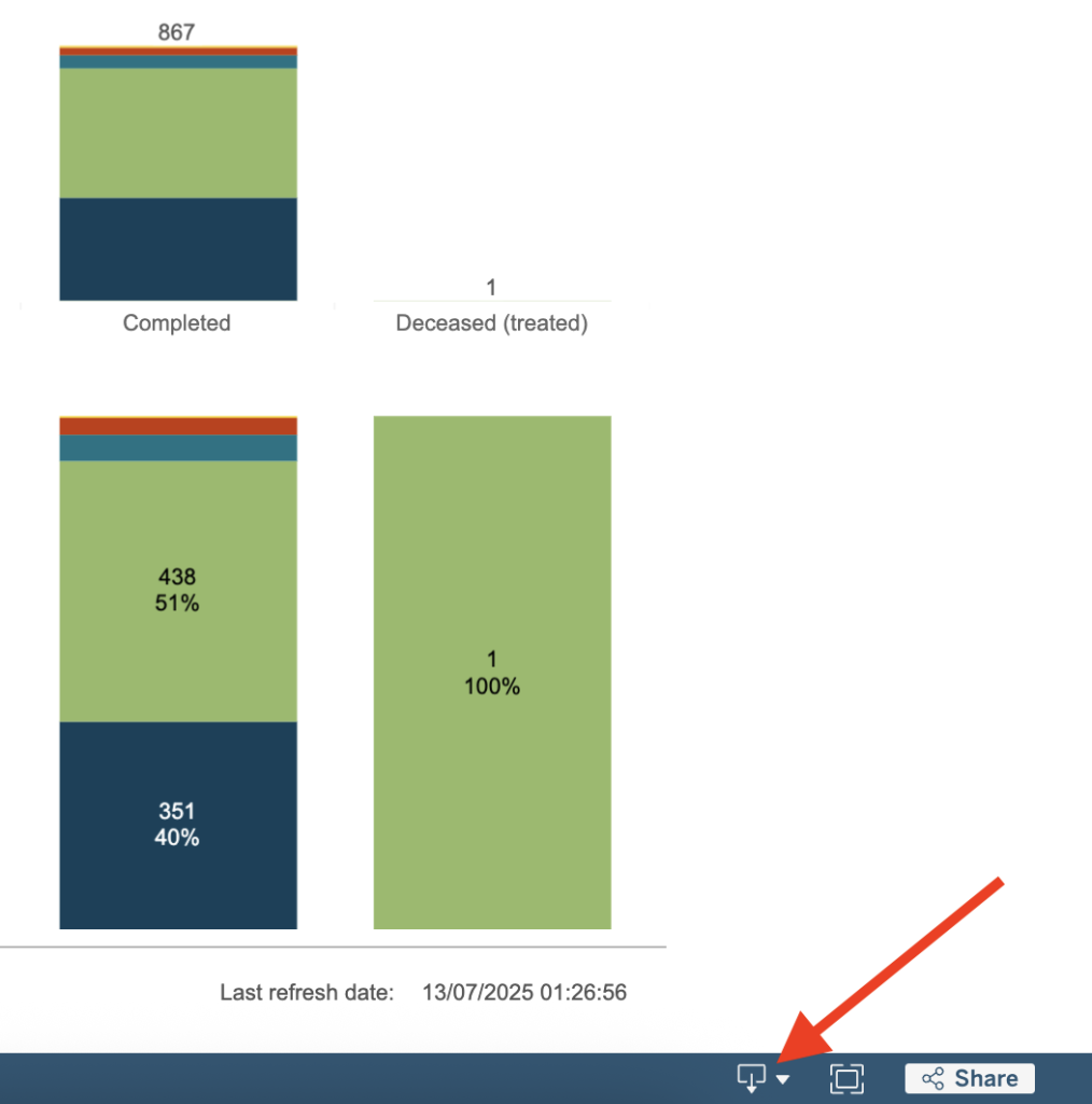
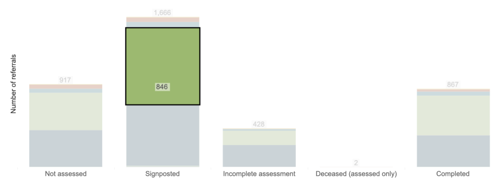
You can select a specific bar in the bar chart by clicking on it, the bar will be shown with a black outline,
and the surrounding areas greyed out.
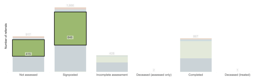
You can select multiple bars by pressing and holding Ctrl as you click on your desired bars.
If you wish to view all data, click on any of the white space around the chart (not on a bar directly). Note that you will not see any visual change to the chart.
When you select the Data option, the results will open in a separate tab. Over on the left you will see the Tabs area. This will allow you to view the data in different ways, dependant on the dashboard and filters you have selected.
The first Tab is the Summary Tab, which basically shows you the data that the dashboard chart was displaying as a table the subsequant tabs will consist of the raw data and you may have some tabs based on the dimensions you selected.
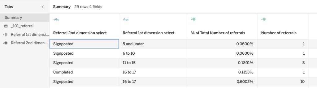
The Raw Data
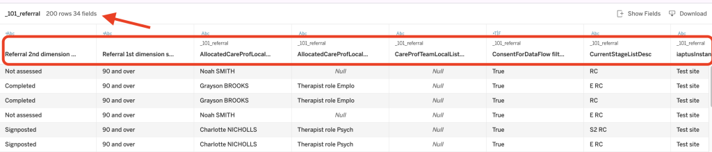
The raw data tab sits under the Summary and will usually look like this _101_referral, the number reflects the Submission report, 101 being the Referrals report.
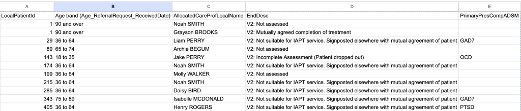
When you select the raw data, you will be presented with a table. It will only show the first 200 records and will list a certain number of fields (columns) going across the table. Underneath will be the data for that column.
Adding/removing table columns
You can switch columns (fields) on/off, to carry this out, click on the Show Fields (Columns) option, found top right. You will be presented with a list of all Fields (Columns) that are available. The ones that are currently active in the table will have a tick on the left of the name.
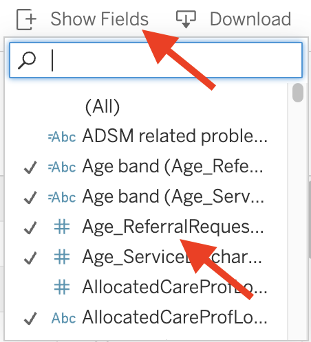
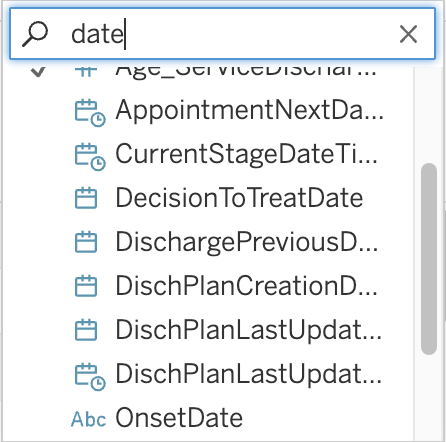
You can scroll down the list or use the search box at the top to search for a specific field (column), it will present you with the closest matches. To active the field (column) click on it.
The new field will be added to the right of the table
Building the data table from scratch
If you want columns in a specific order, you can do this by first switching all active columns off, to do this, click twice on the (All) option as the top of the list, this first will switch the fields all on and then Off.
One field (column) that you will find useful is the Patients iaptus Id, called LocalPatientId, this can then be used to cross reference the patient within iaptus as the data in the table, will not contain any patient identifiable information.
Once you have all the required fields, click on Download, top right. The table will download as a .CSV file, which can then be opened in a spreadsheet app.
Crosstab
Opens a dialog window to select download options. If viewing a dashboard, select a sheet from the dashboard to download. Under Select Format, select .csv or Microsoft Excel .xlsx.For dashboards, all sheets will be listed, including hidden sheets.Any filters, parameters, or selections currently applied in Tableau are reflected in the downloaded crosstab.
Opens a dialog window to select download options. Under Include, select the the part of the workbook you want to download. Select this view, specific sheets from a workbook or dashboard, or select all. Select Scaling to control the image’s appearance on the PDF. Select Paper Size and Orientation.
PowerPoint
Downloads selected sheets as images on individual slides in a PowerPoint presentation. For untabbed views, you can select only currently visible content. However, hidden sheets visible in a dashboard can be selected if you choose Specific sheets from this workbook.
Full Screen
If you want to show the graph full screen, select the Full Screen button bottom left.
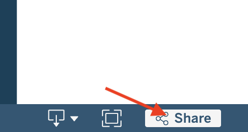
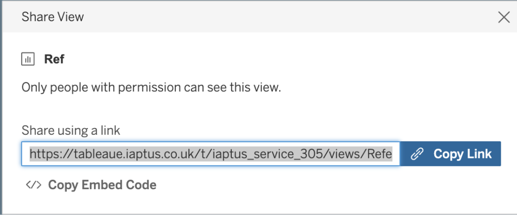
Share
You can share the graph view directly with another user, rather than them having to go through all the steps to navigate to it, by clicking on the Share option
Also you can ask for the embed code to embed into a webpage.